


Project Overview
Disclaimer: This is a self-directed project. I do not work for iNaturalist.
Role
UX Designer
User Interviews, Affinity Maps, Site Map, User Flows
Wireframing, UI Design
Prototyping, Usability Testing
TEAM
Self-Directed
DURATION
December 2021 - January 2022 (4 weeks)
SCOPE
High-fidelity interactive prototype for proposed iNaturalist feature on iOS mobile devices
TOOLS
Figma, Photoshop, Miro
Problem
iNaturalist app’s lack of social features is limiting the overall user engagement with the product
iNaturalist describes itself as "an online social network of people sharing biodiversity information to help each other learn about nature", with its primary goal being to connect people to nature. Users can follow other users and see their activity on the desktop version, but mobile app users do not have these opportunities. In general, the mobile app lacks intuitive way to encounter, discourse, or connect with other users. There are opportunities for huge improvement for increasing overall user engagement by extending these social capabilities to the mobile app.
SOLUTION
Create a follow system for the mobile app with a newsfeed to create opportunities for users to connect with other users.
I designed a profile/home screen for the user with a place for a bio, profile screens with a follow button, and a social feed under the “Activity” navigation icon for users to keep up with those whom the user follows. The intuitive design is based off popular social media sites the user will be familiar with like Instagram and Twitter. This research-driven solution is designed around iNaturalist’s user's most priority needs and paint points, while keeping in mind iNaturalist’s goals.
Prototype
The clickable prototype is below, and also available on Figma.
RESEARCH
Discovering if users want a follow system and how user would interact with it.

Secondary Research
iNaturalist’s users use the app more than half of the time, and they want to be able to connect with other users
Market research data indicates that 1/2 to 2/3 of users of iNaturalist make observations from the mobile version of the product. Since most users are engaging with iNaturalist on the mobile app, it is worthwhile to expand the social functions available on the desktop version to the mobile.
20% of Apple Store review 2% of the Google play reviews explicitly requested having the ability to follow other users on the app version on the. (Full Research)
Competitive Analysis
Identifying a lane for iNaturalist as the citizen science social media
I analyzed other naturalist apps PlantNet, iPlanzen, and Gardenia and iNaturalist. I concluded that iNaturalist has an opening to assert itself as a more of a social media app with optimized social features. I also analyzed popular social media apps to learn from their design patterns. Users will be familiar with the most widely used social media interfaces. (Full Analysis)
Key findings for plant ID apps
No other nature-identifying apps have AI technology to make Identifications.
They do not have as many social features.
No other apps identify animals and fungi in addition to plants.

Apps with related content studied
Key findings for social media apps
Other popular apps with follow systems have different setups, but generally start with a home button on the left.
The search page is generally given its own page at the bottom nave or combined with an explore page.
There is always a newsfeed page at the bottom nav somewhere in the middle. A page for one’s own posts usually goes last.

Apps with follow systems studied
User Interviews
Gaining qualitative and emotional insight into users’ needs
I recruited to five participants who used the iNaturalist mobile app to varying degrees, aged 24-33. I conducted one on one interviews to learn different ways people use iNaturalist and gain empathy for users’ pain points, needs, and sentiments about iNaturalist. More specifically, I aimed to use these insights to determine how a social feature like follow system would best suit iNaturalist users.
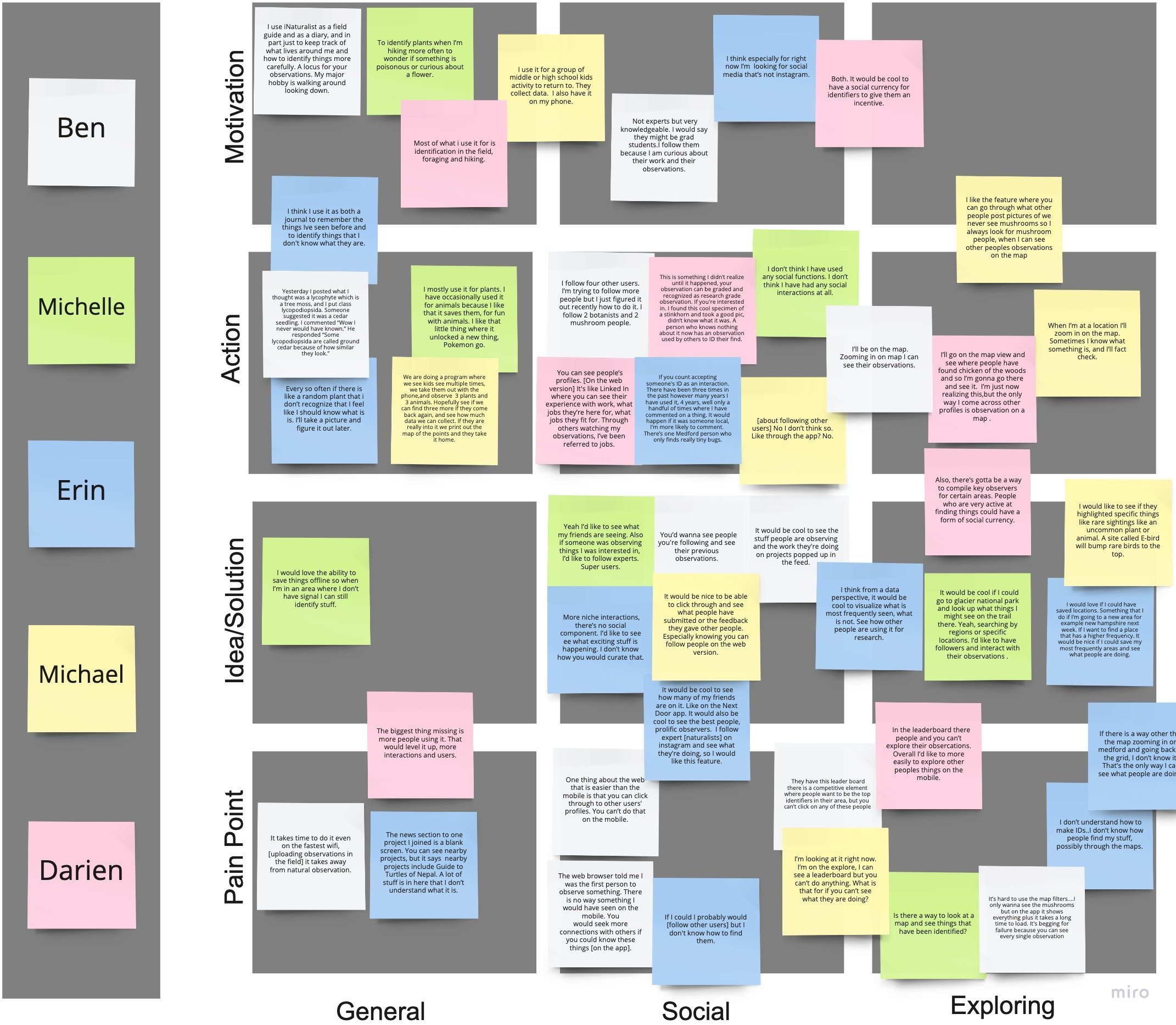
Affinity Map
Finding trends in interview data
I moved quotes from my user interviews in to a map showing their content (general, social, and exploring) and the type of comment (pain point, idea, action, and motivation). This helped me find trends about how people use iNaturalist and their attitudes about it. (Full User Research Debrief)
Key findings
Users want to connect with friends and learn from experts: All participants expressed an interest in having an easier time accessing to more content about others’ observations. 4/5 participants expressed an interest in keeping up with experts in areas or subjects of interest.
Most users primarily use app over the desktop: 3/5 of participants were unaware it is possible to follow others on the desktop version because they only use the mobile app version.
Users need a more intuitive location-based search: 3/5 participants mentioned having trouble or wishing they could explore local observations more easily. Also, 3/5 participants were confused or unsure how others found their content or how to find observations new to their area.
DEFINE
Strategizing solutions based on research findings through product roadmap, site map and user flow

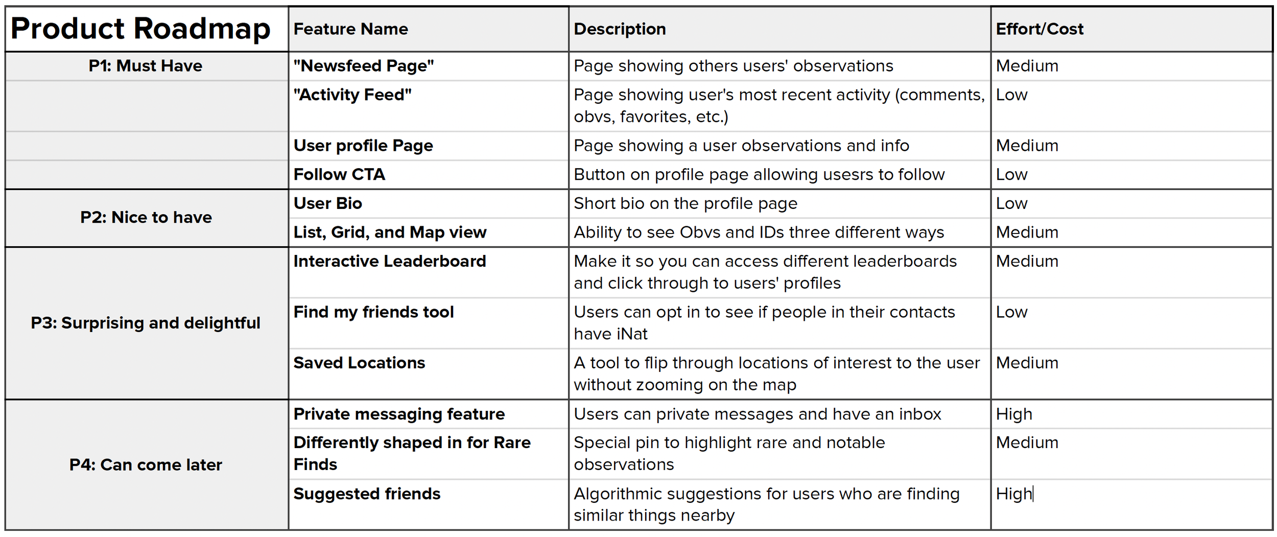
Product Roadmap
Prioritizing solutions based on research
I gathered a set of features that addressed my users’ needs, and evaluated the amount of effort that feature would need to implement it. I prioritized features that would make the most amount of impact toward the product’s goals of increasing engagement, and the users’ needs to find information easily and communicate to other users clearly. Since this project has a limited timeline, I decided to work on P1 and P2.
Site map
Integrating new elements in the existing hierarchy
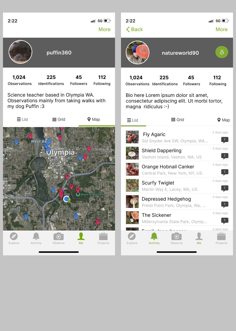
After I decided on the priority elements for the new feature, I outlined a site map. It allowed me to visualize the structure of the mobile app. I determined that I will need to create a social newsfeed, a user profile page, and personal profile page. The personal profile page will display the user’s own observations and link to favorites, identification, followers, and following.

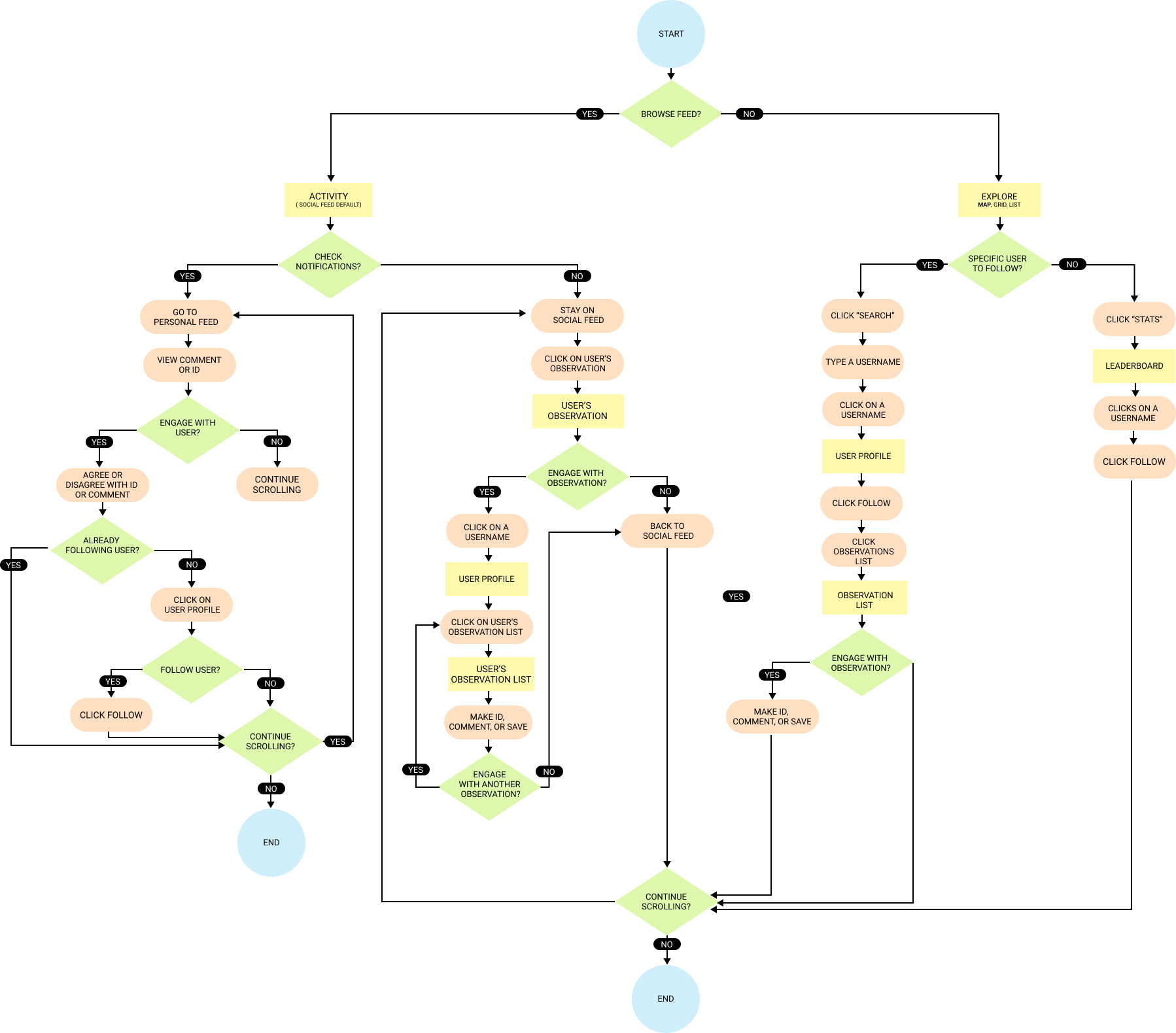
User Flow
Designing ways users can interact with each other
I then designed a user flow following the paths a user can take to encounter another user’s profile and follow them. This revealed that users can encounter other users’ profiles various different ways:
Their activity feed
Comments or IDs of their recent activity
Through searching
Through the leaderboard
I planned build to build out a testable user flow for the first two, and suggest the following two tasks be designed and tested for next iteration.
Design
Implementing the plans for a follow system with wireframes

Low Fidelity Wireframes
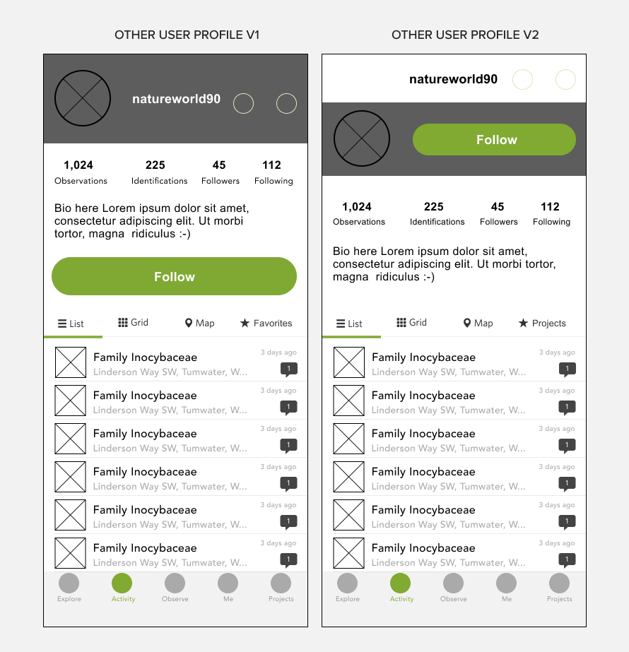
Combining iNaturalist’s UI with UI conventions in social media
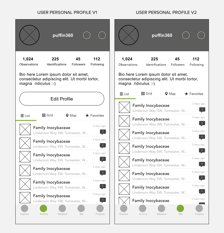
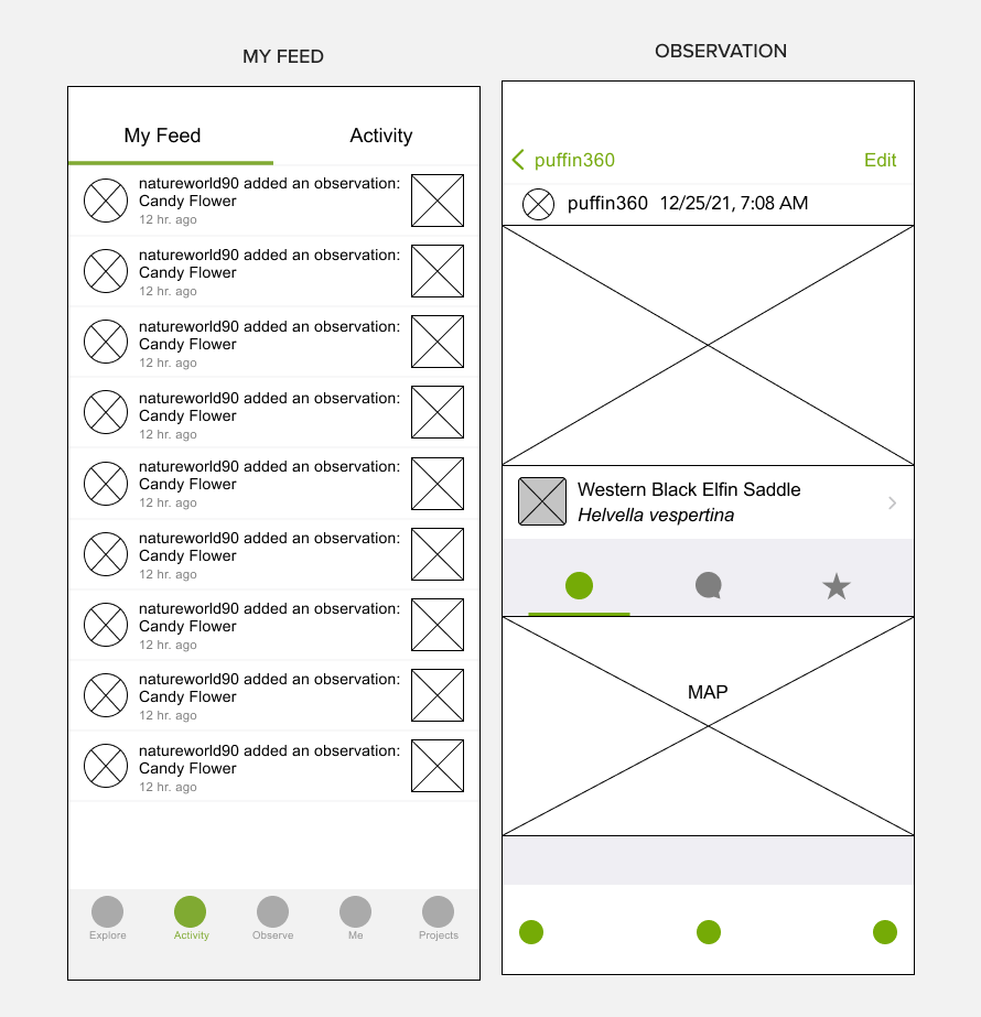
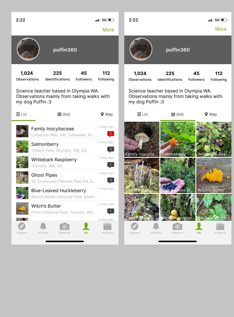
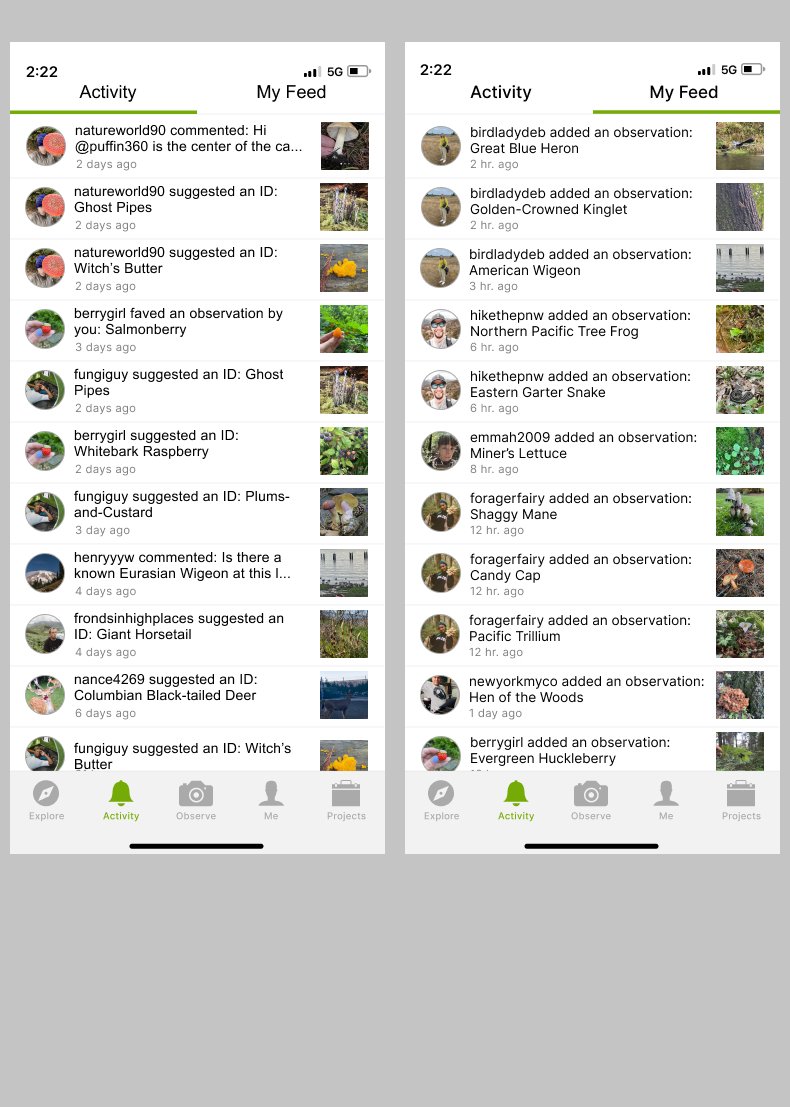
I created 2 iterations of the user’s personal profile and another user profile with follow button, and planned to try both in the high fidelity iterations. I referenced features of Instagram and Twitter’s UI to make the screens seem as familiar and intuitive as possible. Then, I created frames for the Activity and My Feed screens. I decided to call the social feed with observations made by users someone is following “My Feed” since this was a convention of other products with follow systems.
High Fidelity Wireframes
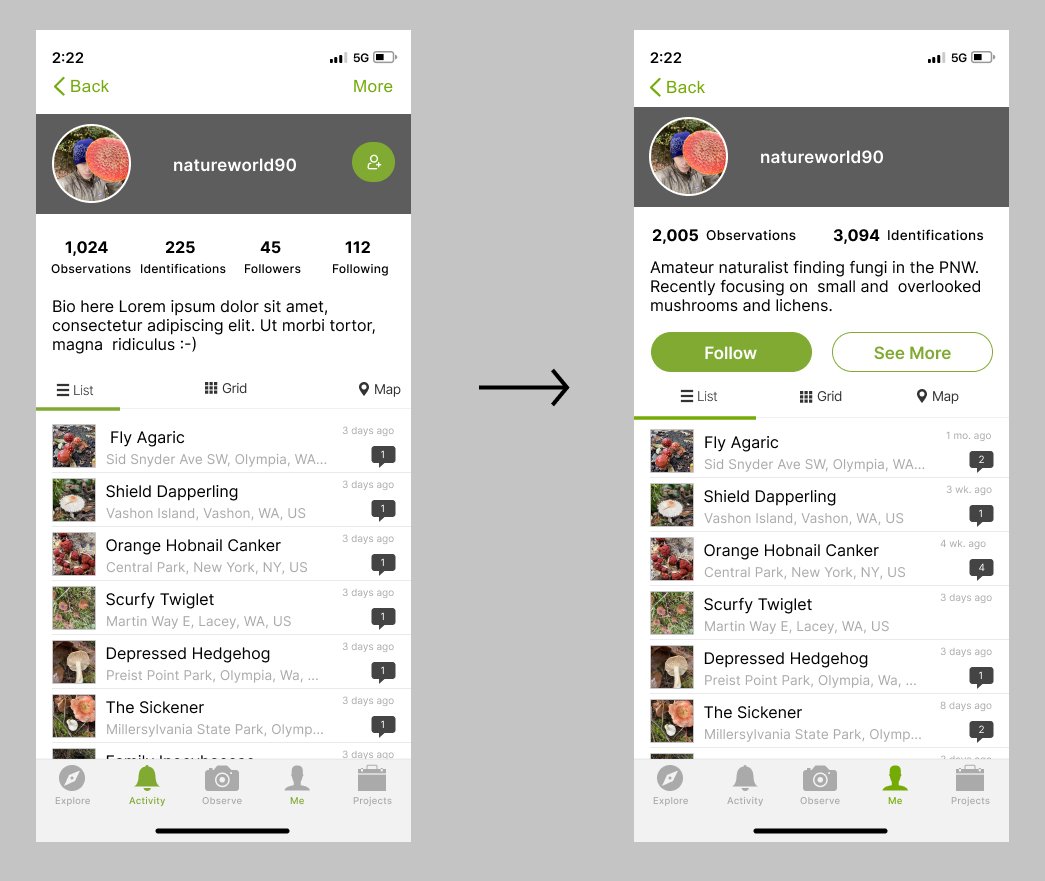
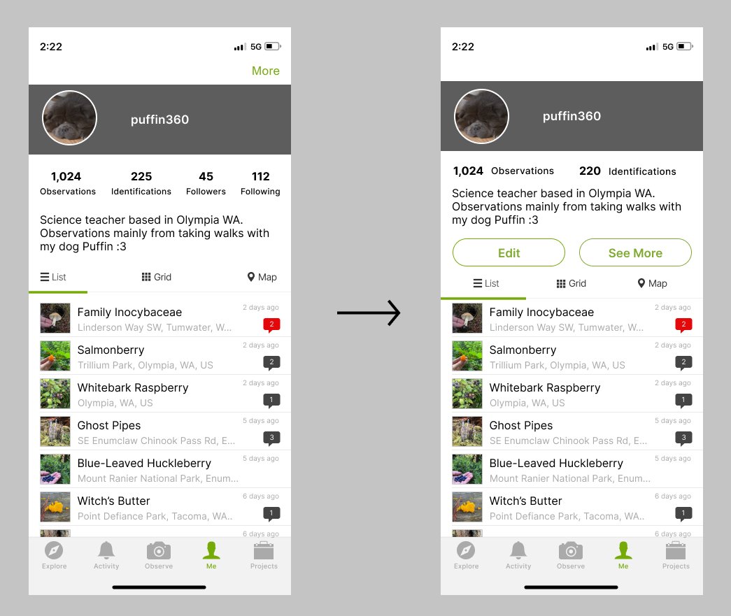
Iterating on the profile pages
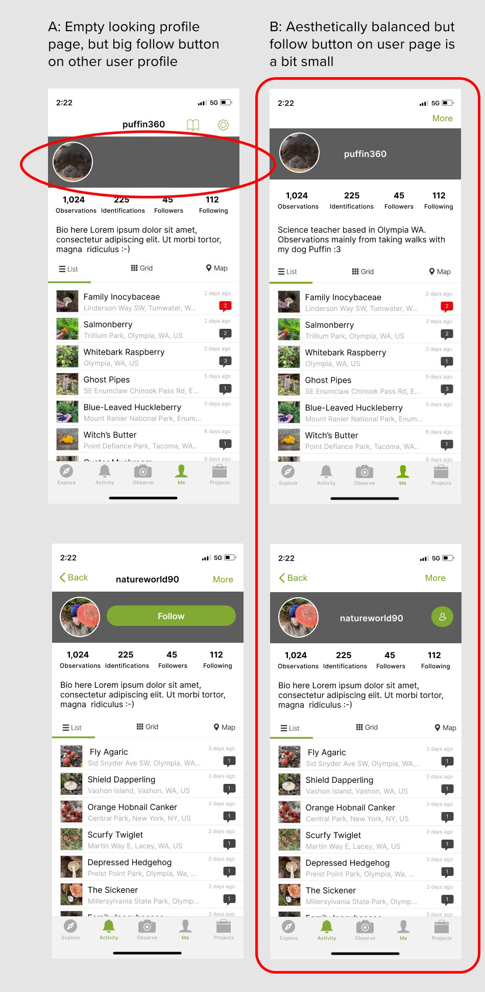
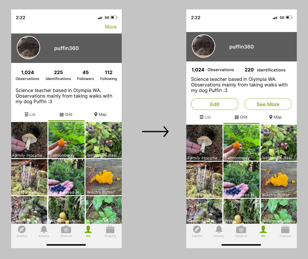
I created some iterations of the personal profile and the other user profile pages. Each version had its pros and cons listed below. I decided to choose option B and test it. My reasoning was based seemed the most aesthetically balanced, and since it was the least intrusive follow button to the design. I was interested to see how easily users could get to it easily. If it needed to be bigger I could adjust from there.
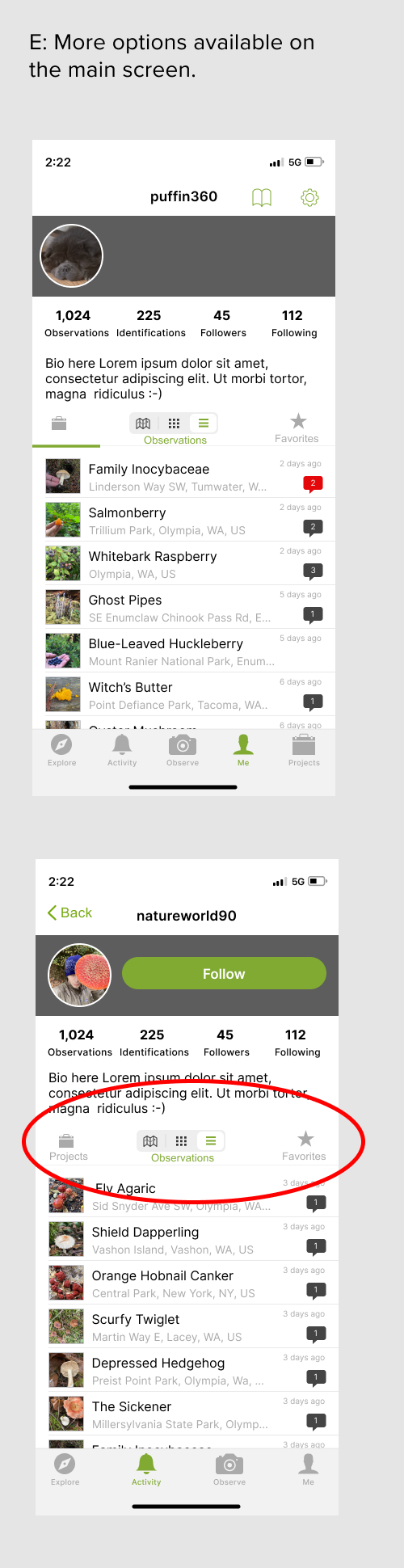
High Fidelity Wireframes
Creating screens with content for testable user flows
I created wireframes needed for a user flow for one to start on one’s profile page with observations, check the most recent comment on an observation, click on the commenter’s profile, and follow the user. An alternative flow is checking the Activity to see most recent IDs and comments, click on the most recent commented on observation, click on their profile, and follow them.
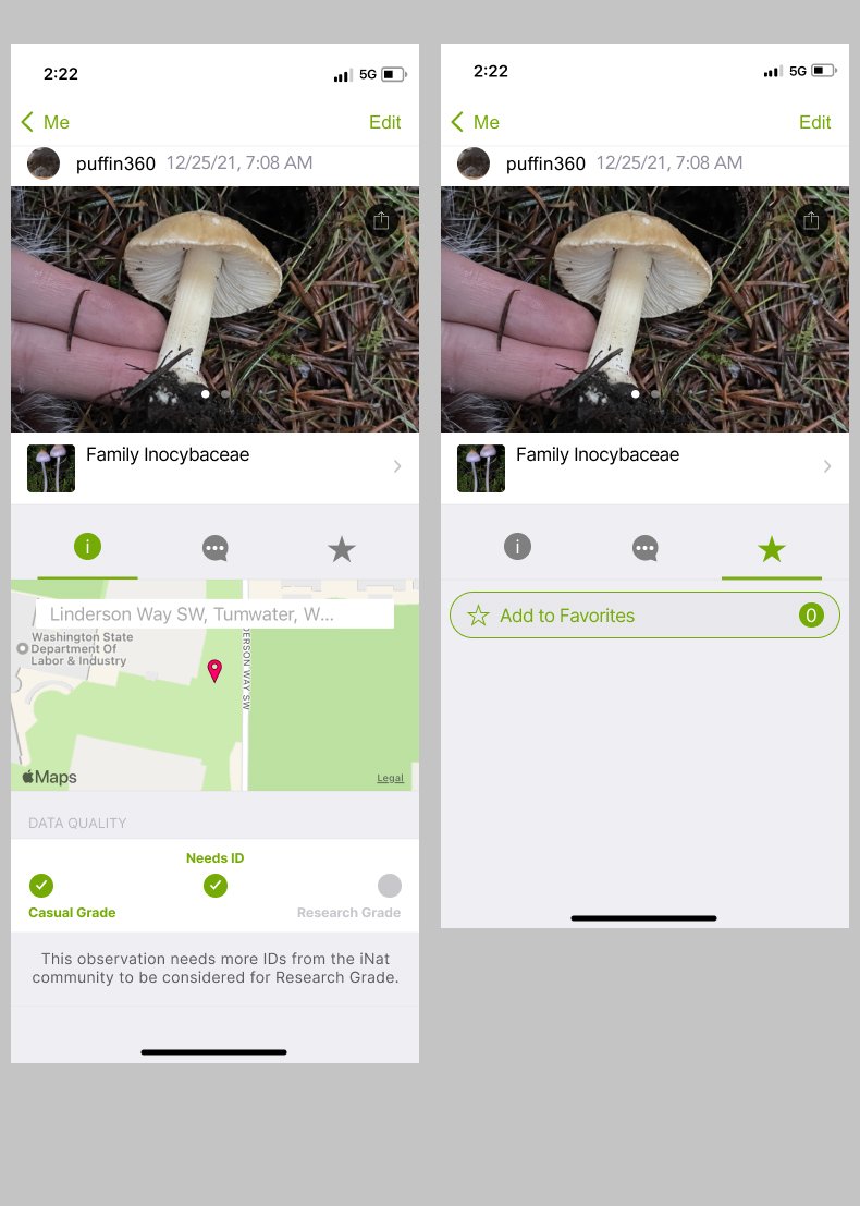
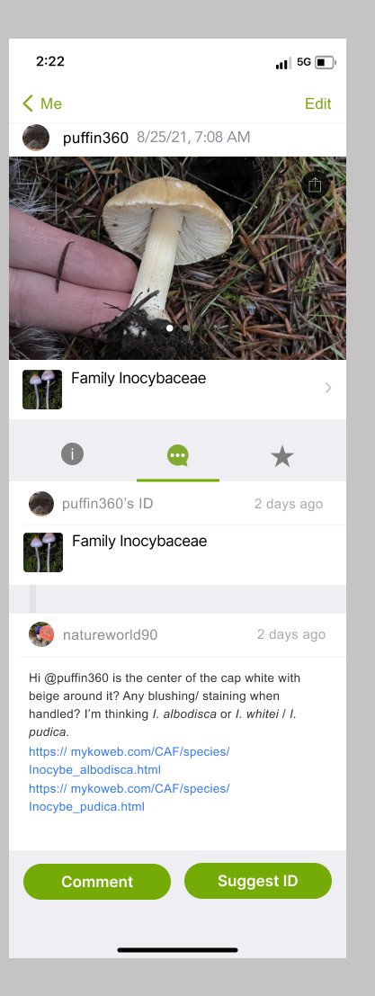
test
Revealing successes and shortcomings through usability testing

Usability Testing
I conducted usability tests to substantiate or disprove our hypothesis that users want this feature and to gain insight to optimize experience of following another user. I recruited 5 participants and asked them to complete two tasks:
Participants were asked to navigate to the most recent comment on their observation, go to the commenter’s profile and follow them.
Participants were asked to check their activity, find the most recent comment, go to the commenter’s profile and follow them.

Key findings:
The follow button should be more noticeable: 3/5 Participants hesitated while finding the follow button during the first task. One participant had trouble finding the follow button, and was looking for the word “follow”.
Users are enthusiastic about this feature: 3/5 Participants expressed that they wanted this app to be implemented, without any prompting about the subject.
Adjustments: Changing the Follow Button Interface
Referring back to research:
I referred back to iNaturalist’s goal of being “online social network of people sharing biodiversity information to help each other learn about nature” and determined that a more prominent follow button was in alignment with the organization’s goal, as well as the users’ goal of accessing features expediently.
Consulting other designers:
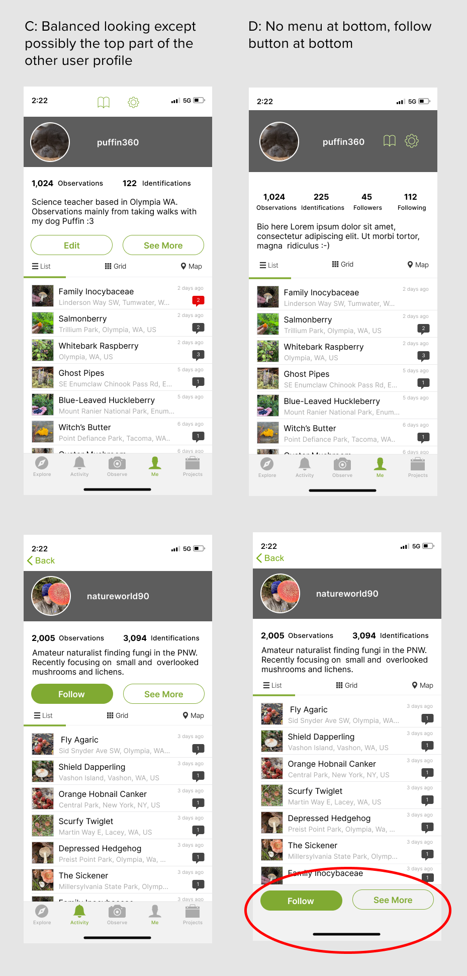
Since some participants had trouble finding the follow button, I consulted a group of other designers about the situation. I presented my previous iterations and everyone selected option C because the priority should be on making the product intuitive by conforming with most with other social media interfaces.
The Prototype
Try it out! This prototype is intended to test for the following user tasks:
Test how a user would find another user’s profile
Test how a user would follow another user
Key Takeaways
Users respond to familiar design patterns: Design patterns that are conventional to more common applications will be the most predictable to users. When introducing a new feature this predictability will improve the user experience.
Prioritize features important to most users: You can’t please every user or include every feature, but prioritize features important for the most common use-cases.
Seek advice from other designers: You can get a lot of information from research and synthesis, but conversing with a team can also help clarify a line of reasoning to help come to a decision. However it’s necessary to be prepared with research and visuals to back up your inquiry.
Next StePs
I suggest ideating, iterating, and testing the leaderboard and search functions. Based on my research, users have many pain points involving these features. Additionally, there are many opportunities to enhance the social aspect of these features now that the fundamental follow system has been designed.
