

Project Overview
Duration
January 2022-February 2022 (5 weeks)
Scope
High-fidelity interactive prototype for relevant tasks on iOS mobile devices
Tools
Figma, Photoshop, Miro, Procreate
Role
UX Researcher / UX Designer
User Research, Persona, User Flows
Prototyping, Usability Testing
UI Design, Interaction Design, Visual Design
Team
Feedback and dev: Collective Focus
Problems
There has been a decrease in overall participation in the community fridge movement.
During the COVID-19 pandemic in NYC, community fridges were developed response to a significant increase in food insecurity. While there is still a very large population of people who need food from the fridges, the current scale of participation in servicing the fridges from the general public has significantly dwindled.
There are many communication challenges servicing and receiving food from independently run community fridges.
The current community fridge map is not up-to date as fridges frequently lose their permitted locations, break, or change locations. Each each fridge is independently run, so it can be difficult to optimize when food distribution and communication between people who receive food from fridges and people who service the fridges.
Solution
Design a responsive website and create effective branding to unify the project.
Allow users to easily locate fridges via an interactive map.
Allow users to upload photos, make notes, update the fridges, and check fridges.
Branding to help the community fridge movement feel memorable and approachable.
The Prototype
Clickable prototype to the right, and also available on Figma.
RESEARCH
Learning about who the users are, what their needs are, and how to reach more users.

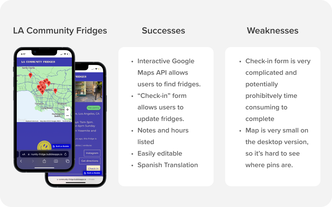
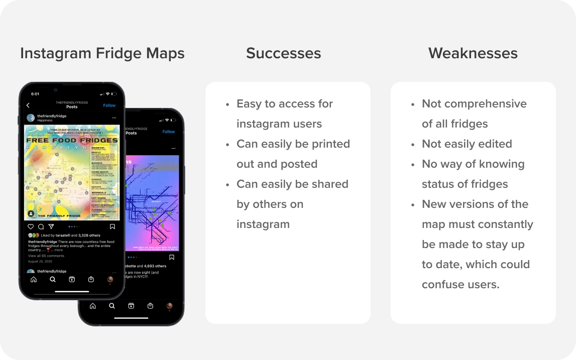
Competitive Analysis
Strategy
I analyzed the LA community fridge website as well as some other ways people can find information about fridges, which primarily were maps posted in Instagram.
Key findings
The product should be scalable. Both of the methods studied are more effective for a smaller number of fridges and would not be as feasible given the quantity of community fridges in NYC. Scrolling through a list of the 21 fridges in LA is much easier than the ~130 fridges in NYC.
Use UI familiar to the users, e.g. Google Maps: There are some features that helped to inform the NYC Community Fridges website such as the interactive map and update form. This way users can have some familiar footing when learning to use this new tool.
Interviewing experts on NYC community fridges
I conducted interviews with people who have >1 year of frequent experience maintaining/ adding food to the NYC community fridges. These interviewees would serve as subject matter experts.
I was having difficulty finding users to interview due to time, distance, and technology constraints.
However, consulting (SMEs) helped generalize certain trends and gaps of knowledge that only someone who had considerable experience working in the field would have access to.
Key findings
The main users of the fridge are immigrant families and houseless people who receive food, and various organizers and community members who supply food.
The main demographics of the food recipients of the community fridges vary among different neighborhoods, but are primarily immigrant families that are from Latin America or China. The other main demographic of people who use the fridge are houseless people. Both of these groups are excluded from other types of support like food stamps, unemployment, or other types of relief.
The main languages spoken are English, Spanish, and Mandarin Chinese
The other users of the fridge are the people who service them. These users’ demographics vary widely. They are generally local organizers and community members.
Users need current accurate information about the fridges
There is a huge demand for the community fridges, but the project could benefit from increased awareness and participation from people who maintain the fridges.
The statuses of fridges are changing constantly, (whether they are full or empty, need to be cleaned or serviced, or occasionally change locations) and this can often cause problems.
People who service the fridge could all benefit from a guide with tips on how to offer food to the fridges in the most helpful way (how to clean fridges, not leave boxes out, label food, package food, know which foods are in demand, etc.)
The primary way people check the statuses of the fridges online is through Instagram, but this is not very reliable.
Both people who maintain the fridges and people who use them are more likely to see the website on their phones.
Bringing data and empathy together with personas
I created descriptions and illustrations for three key personas based on my interviews. Alex represents the community-minded individual who uses the website to facilitate giving food to the fridges. Maria and Fred represent the respective immigrant and houseless populations who commonly use the community fridges for food security.

Strategize
Defining main features of the website and how users will interact with it through storyboarding, sitemap, and user flow.

Storyboards for Maria and Alex
Illustrating how user groups will interact with the product
I created a storyboard to help visualize how a user would interact with the product in relation to the the community fridges. The first one shows Maria using the site to find a fridge near her and check the status of it. The second one shows Alex finding a fridge to add food to, and updating the fridge listing on the site.

Building a Site Map
Structuring the site for the most common use cases
I kept these main principles I learned in my research in mind:
Users of the website are most likely to be checking the status and location of a fridge.
The process needs to be as simple possible or users may abandon the task of updating the fridge.
Best practices guidelines, adding a fridge, and general info are less important but should be easily accessed accessible.
This helped me determine that I will need to create a home page with the fridge map, an individual fridge page, and a page for updating fridges as part of the user flow I was planning on testing.

Creating a User Flow
Receiving or giving food from a community fridge
I designed a user flow following the paths a user can take to either give or receive food from the community fridge. The flow extends beyond finding the fridge for users who plan on giving food to the fridge, so they can update the current state of the fridge on the website.

Design
Actualizing the product through creating brand identity and iterating on wireframes.

Branding and Style Tile
Designing an approachable image
I iterated on the idea of an icon-like smiling fridge, with a readable typeface that matched the rounded style of the logo. The purpose is to give the community fridge project a friendly image to encourage new users and make the project more cohesive and memorable.

LOGO ITERATIONS
Keeping licensing and budget constraints in mind
While I originally chose Helvetica for the text and Hoops for the logo, I ended up switching to similar fonts Inter and MuseoModerno respectively. This was because they were both Google fonts with free licenses, which acommodated the budget constraints.
Checking for contrast issues and putting UI together
I also ran a contrast check and made sure my colors had enough contrast to them. I realized I needed to make my dark gray text slightly darker and the bright blue color needed to be darker to provide enough contrast for the white text on my CTA buttons. Once I was satisfied with my choices I put them together in a style tile for reference, and made necessary edits when I had finished my high fidelity wireframes.

Low Fidelity Wireframes
Creating icon-based navigation and interactive map
I planned out the layouts for the landing page and map pages, and made made some icons for the navigation. I planned on using a lot of icons to help make the site easy to understand for people with limited reading comprehension skills.
I also made the decision to have a functional map on the landing page for the desktop version, but users can click the button to navigate to the map with list-view and extra features. For the mobile version, users will be prompted to click the button to get to the map, but the button will be overlaid on the map to give them a sense of where they are going.

High-fi Wireframes: 1st Iteration
Adding color, illustrations, and icons
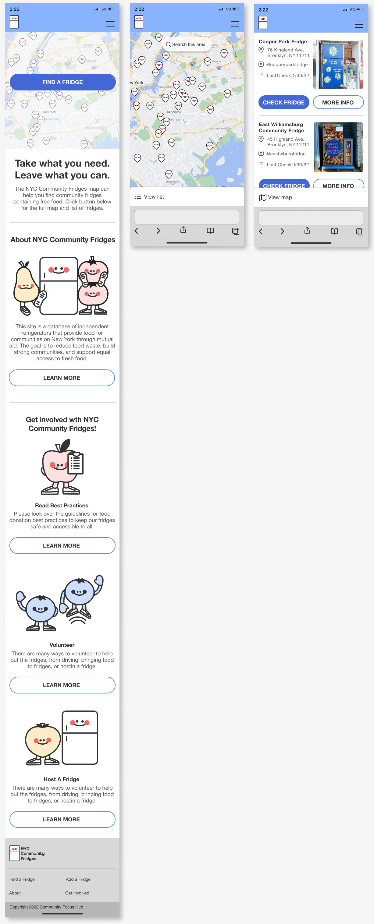
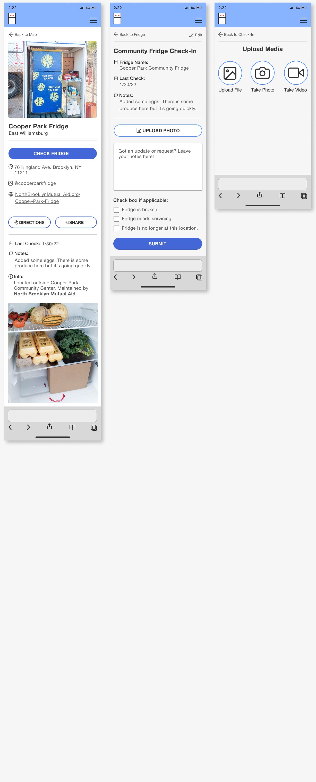
I created frames for the landing page, the map page, the fridge page, and an update form page. The landing page features some drawings I created to illustrate the content and enforce the approachable and friendly branding. Keeping my research in mind, I planned on testing the mobile version, so I designed the photo uploading process for that as well. A Figma Presentation with the most up-to-date high fidelity desktop wireframes is available here.

Creating wireframes for “Fridge Update” user flow on mobile
Since users are more likely to use the website on their phones, I planned on testing the mobile version, so I build out the full user flow for mobile.
The “Fridge Update” flow includes finding a fridge, uploading a photo, and writing notes about the current status of the fridge.
I based a many of my design patterns for this flow on Google Maps since users will most likely be familiar with searching for locations with Google Maps
test
Determining efficacy of the user “Fridge Update” flow through user testing and iterating based on findings

Identifying Points of Confusion Through Usability Testing
Key Findings
Users reported being confused about photo-uploading process, especially about the next step after uploading a photo.
Users respond well to the fridge-finding flow and the design.
The Testing Strategy
Participants will be asked to find a fridge and check it, and then update the fridge.
Participants will be completing testing on the iPhone 8 version of the screens since my research indicated users may not have newer phones.
Participants were 100% successful completing the task, but 50% made errors.
Identifying Points of Confusion Through Affinity Map
I made an affinity map to plot the positive comments, pain points, and suggestions, the participants made throughout the study. It quickly became clear that the fridge checking and updating process should be re-assessed.
The micro-copy should be more clear and consistent, and the “Next” button needed to be more visible.

Stakeholder and Developer Feedback
Adding color-coded pins and language detection
The stakeholder I consulted is the person in Collective Focus Hub most involved in the community fridge project who will be facilitating the development of the new website/map.
She suggested color coding the fridge icons to indicate which fridges were running and well serviced, which fridges needed to be updated, and which fridges were broken, and which fridges had moved or disappeared.
The lead developer suggested that instead of having a language option, the product can detect the language of the device and translate it automatically.
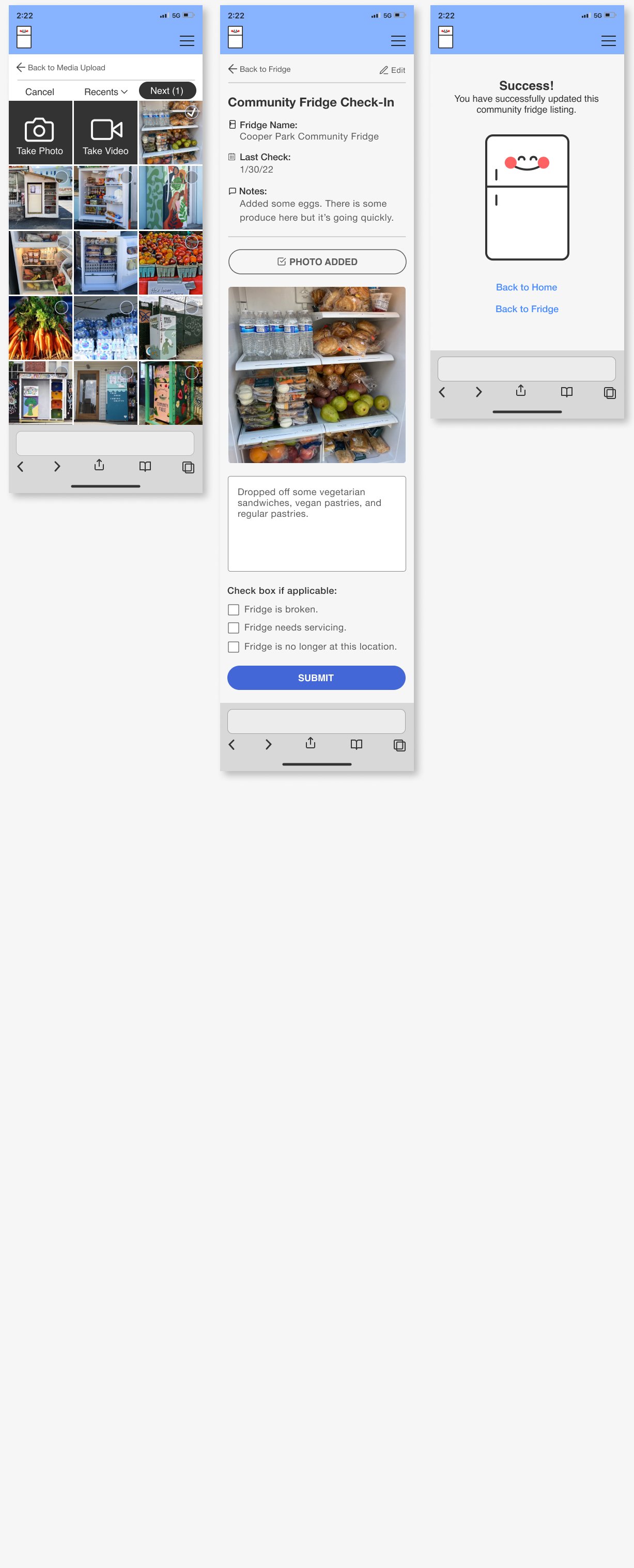
Adjustments Based on Testing and Feedback
Clarifying micro-copy of buttons
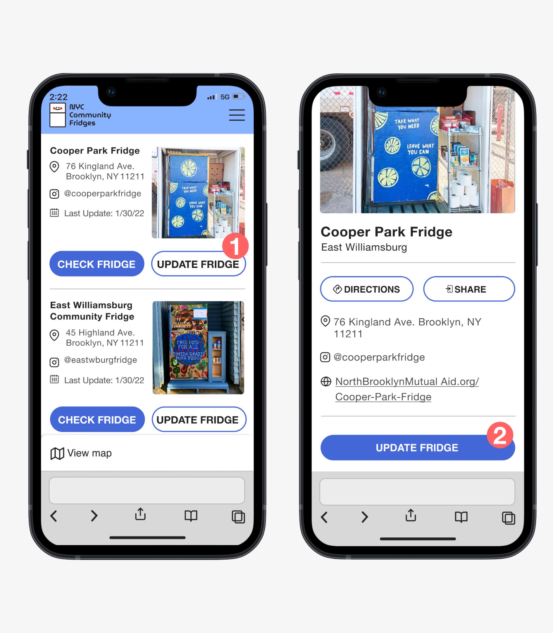
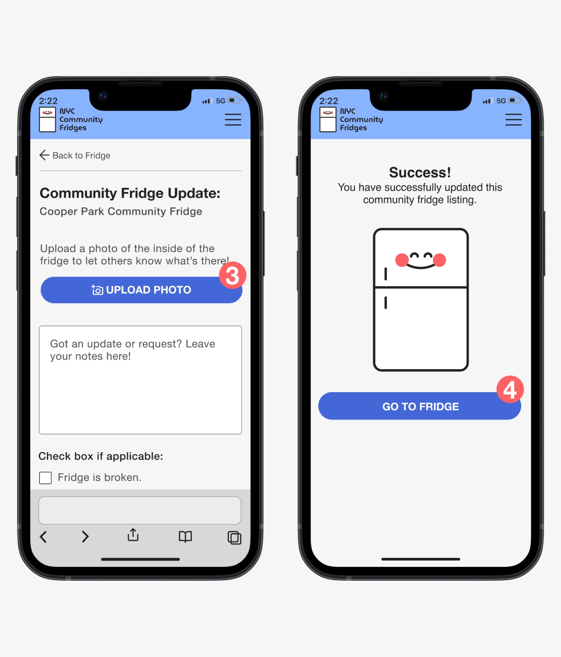
1. Changed microcopy of “more info” button to say “check fridge”.
2. Changed microcopy of “check fridge” button to say “update fridge”, and moved button down so users are more encouraged to scroll to view the additional notes and information about the fridge.
3. Made the “upload photo” into a primary (blue) button to make it more immediately visible to users.
4. Made link in the final frame into a primary button directing users to see their updated fridge listing.
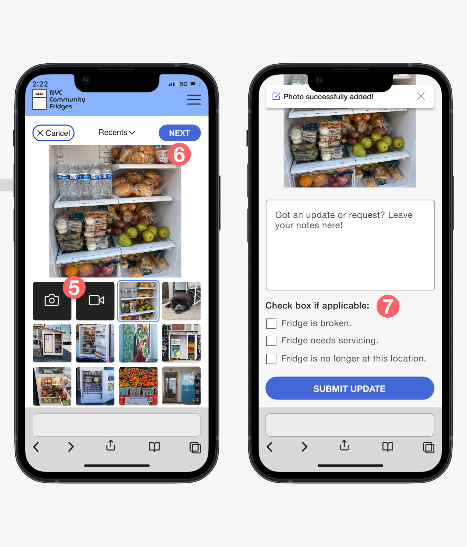
Simplifying the photo-uploading process
5. Made uploading media from photo library the default option.
6. The selected photo is larger than the thumbnails, so users can see what photo they will be uploading clearly. The first photo in a user’s “Recents” photo album is chosen as a default.
Adding check box and language options
7. Added optional checkboxes for users to fill to provide information on whether a fridge needs servicing, needs replenishing, or has changed location.
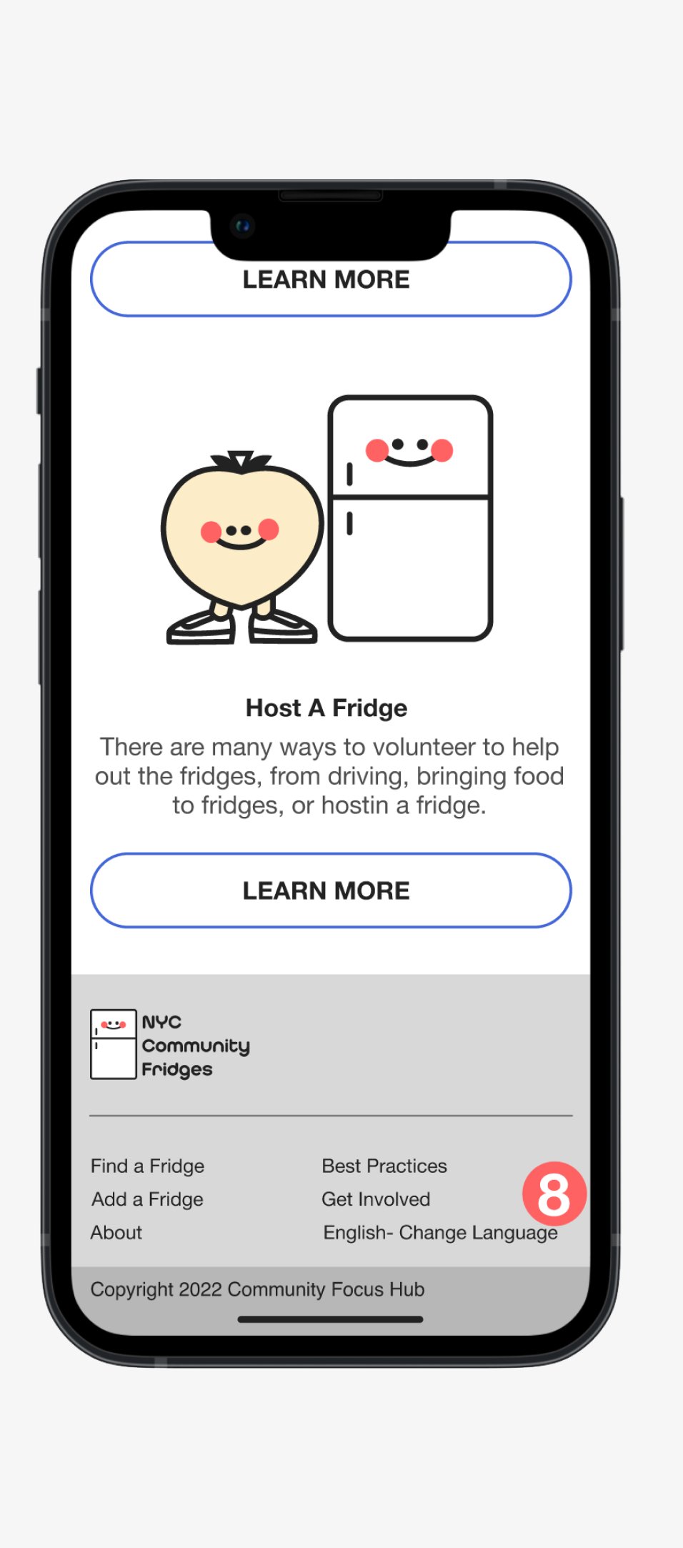
8. Added option to change language in footer.
The Prototype
Try it out! This prototype is intended to test how a user would find complete the following tasks:
Test how a user would find a fridge
Test how a user would update a fridge
Key Takeaways
Consult experts on the subject: Having more in-depth conversations with people who had the most amount of experience with the community fridge project gave me more information than I could have gotten by interviewing individual users of the fridges.
Use clear and consistent language: Keeping the copy and microcopy consistent is important in guiding users to the desired user flow. Users want to know exactly where a button is going to take them.
Keep the user’s limitations in mind: When making a product for people who have minimal access to the latest technology, and may not have strong English language skills, make sure your product is designed in a way that can be easily comprehended and loaded on older models of screens.
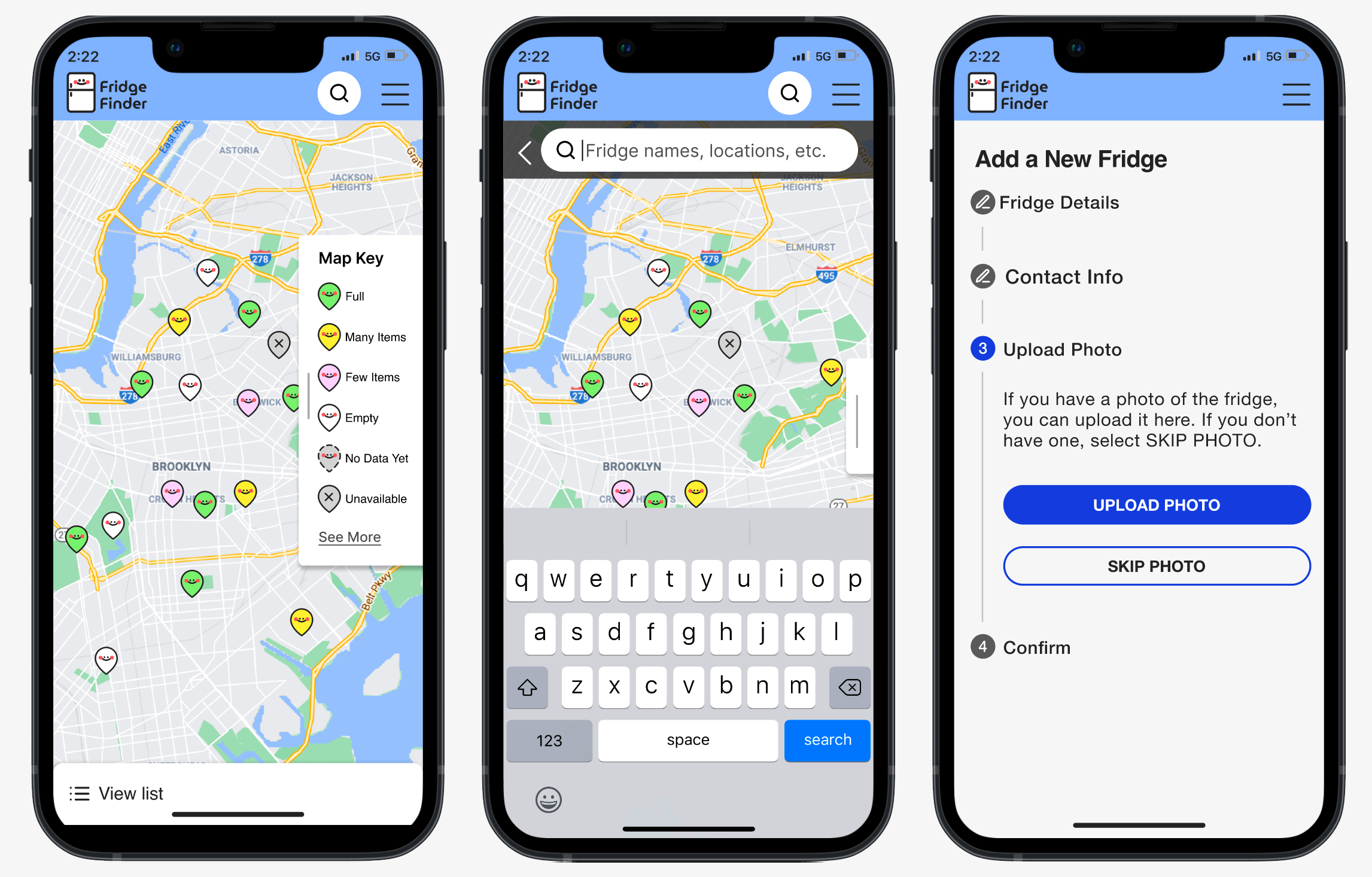
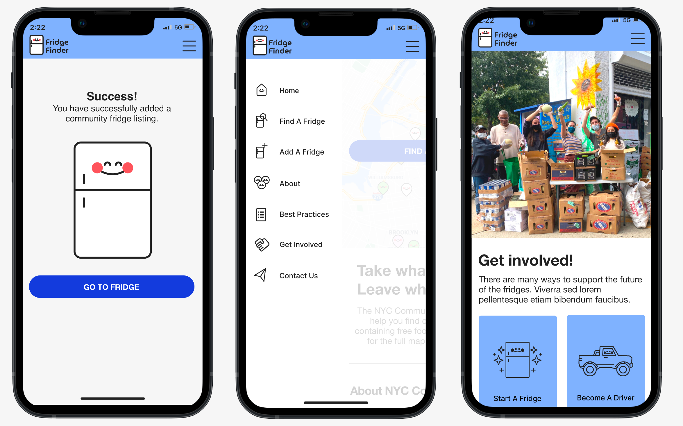
updates: Fridgefinder Web app
I fully designed this site alongside developers from Collective Focus. What started as a responsive website became a web app, renamed FridgeFinder. Since completing this case study:
I designed a mobile menu and all screens needed for the full site functionality.
I added the color-coded pin system for users to be able to immediately know the statuses of fridges before clicking on the fridge pages.
I included a search function for the interactive map. Users can search by key words for locations or names of fridges.
If you’re interested in seeing the updates, please check out the newest prototype here.