


Project Overview
Disclaimer: This is an educational project. Mirror is not real company.
DURATION
6 weeks (November 2021-December 2021)
SCOPE
High-fidelity interactive prototype for relevant tasks on iOS desktop
TOOLS
Figma, Photoshop, Optimalsort, Pen and Paper
ROLE
UX Designer
User Research, Persona, User Flows
Prototyping, Usability Testing
UI Design, Interaction Design, Visual Design
TEAM
Self-Directed
Problems
Creating a brand image users connect with
Creating a e-commerce site where users can easily find and purchase clothing
Mirror is an online resale clothing store that has been selling their clothing from the online platform Etsy since 2014. They have been extremely successful selling vintage and designer items on this platform, but want to create a bespoke e-commerce platform. They plan to rebrand their logo and overall image to accompany the new web-store.
Solution
Designing a responsive e-commerce website and create branding
Designing a responsive e-commerce site that Mirror’s team can promote on their social media and compete with other resale stores/ platforms. Site will feature a digital branding style that reflects the taste of Mirror’s client-base and the store’s clothing style as well as optimized navigation and filtering for a wide variety of one-of-a-kind items. The goal is to make more sales by creating an optimum experience for finding and purchasing their products and having a memorable and clear brand identity.
The Prototype
The clickable prototype is below, and also available on Figma.
RESEARCH
Understanding users needs to optimize their shopping experience through competitive analysis, user interviews, and persona

Research Objectives
This research aims to identify the optimum user experience for Mirror’s customers, reach more potential customers, gain more returning customers, and increase sales.
Understand any potential pain points users may encounter in competitors’ online stores, and if any of these pain points prohibit users from making purchases.
Competitive Analysis
I analyzed the strengths and weaknesses of other successful vintage resale stores and resale platforms to establish a starting point for what Mirror’s users expectations are for the new site. I also created some preliminary personas based on my research and my own knowledge.

Key findings:
Online resale stores: strong aesthetic brand identity and difficult navigation
Competitor online vintage stores such as Treasures NYC, James Veloria, and The Corner Store have strong visual identity either in the UI design of the site, or the styling and photography.
They rely on people staying updated with them through instagram and newsletters.
Some competitors could improve their navigation.
Online resale platforms: neutral brand identity and easier navigation
Online platforms like Depop and The Real Real are more neutral. They forgo strong aesthetic personality with clear, concise UI.
Their weakness is they have less control over curation and more impersonal customer service.
User Interviews
Developing empathy for Mirror’s users
I recruited 6 participants ages 26-31 who shop at resale stores at least 4 times a year. I created an interview guide that provided some background information about the project and targeted questions about general online shopping habits, purchasing habits, and browsing habits.
Key Findings:
Site should focus on users’ needs for searching capabilities, price options, and accurate descriptions.
Participants share a desire to efficiently navigate an easily searchable database to browse for clothes and a simple checkout process.
Their biggest pain point is risking whether the clothes online will fit or match the description.
Persona
Distilling interview findings
Based on my research findings, I created a main persona to deepen my understanding of Mirror’s users’ needs and motivations. This proved helpful in synthesizing some of the common data I collected in my interviews and became a touchpoint for making design decisions later on.
Alex’s main motivations are to cultivate her personal style within her budget. She needs to be able to find items she is looking for and make purchases with ease.

DEFINE
Strategizing solutions and building a framework

Prioritizing Features
Considering business vs. user goals
I identified Mirror’s business and user goals as well as considerations for technical feasability in orderto zero in on key features of the website. These goals were used to help prioritize features. I determined the site should prioritize the following things:
Well organized and logical navigation
Simple and fast checkout
Minimizing returns

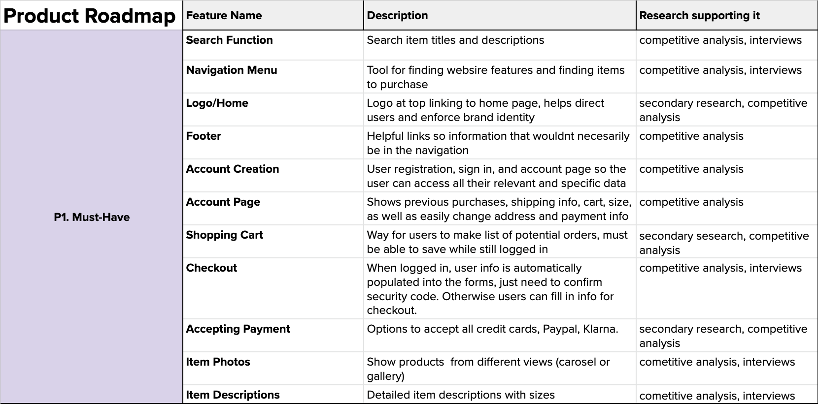
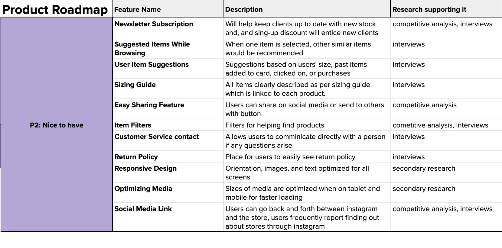
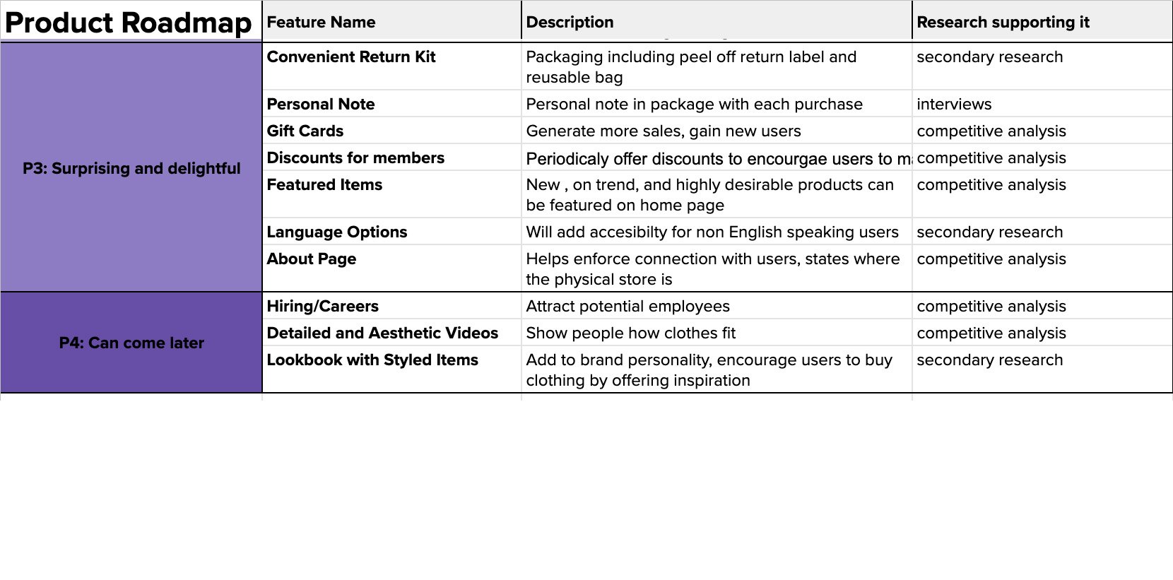
Deciding on features with a product roadmap
With these goals in mind, I brainstormed a more detailed list of features and prioritized the into 4 groups. Features that would achieve more impact on the product’s goals and cost the least amount were in the higher priority group. For the sake of creating the MVP in time, I focused on P1 and P2 seen below. (Full Roadmap)
Card Sorting
Sorting out information architecture
I performed an open card sorting in order to gain insight into how users categorize items. This process helped me gain a sense for what users’ expectations are for the hierarchy of categories for the articles of clothing. (Full Card Sort)
Key findings
Users expect men and women’s clothes to be higher level categories
Users mainly divided articles of clothing into categories pants, tops, outerwear, footwear, and accessories.
Some articles were less straight forward to categorize like those associated with them such as sweaters and sweatshirts. Users had differing thoughts if they are tops or outerwear or their own category.
Site map
Deciding on structure based off of cart sort and competitive analysis
Once I decided on the site's features and had some insight on the item categories, I created a site map to diagram the website structure. I used the insight from my card sort to determine that the home page would feature a Men’s and Women’s clothing page, as well as for the categories and subcategories I chose within those main categories. I also chose to feature New Arrivals, My Cart, About Us, Contact, and Newsletter pages based off of my competitive analysis.

User Flow
Defining important tasks from the user’s tasks
I designed a user flow following the paths a user could take to land on the site, find an item to buy, and complete the check-out process.
Users can navigate to the homepage various ways. They can navigate to categories, collection, or search from there. From the category and collection pages, they can filter results to find a product.
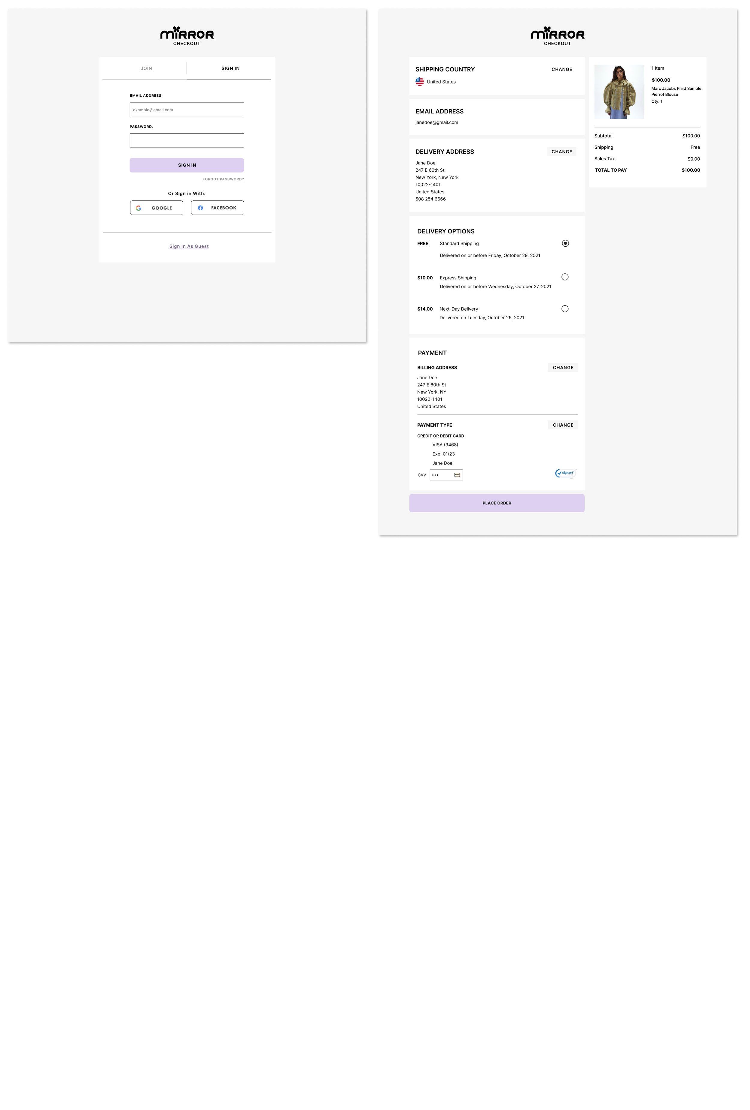
The checkout process requires users to add an item to their cart. They can sign-in or create a new log-in, confirm their payment details and confirm their purchase.

Design
Wireframing, Interaction Design, and UI Design

Low Fidelity Wireframes
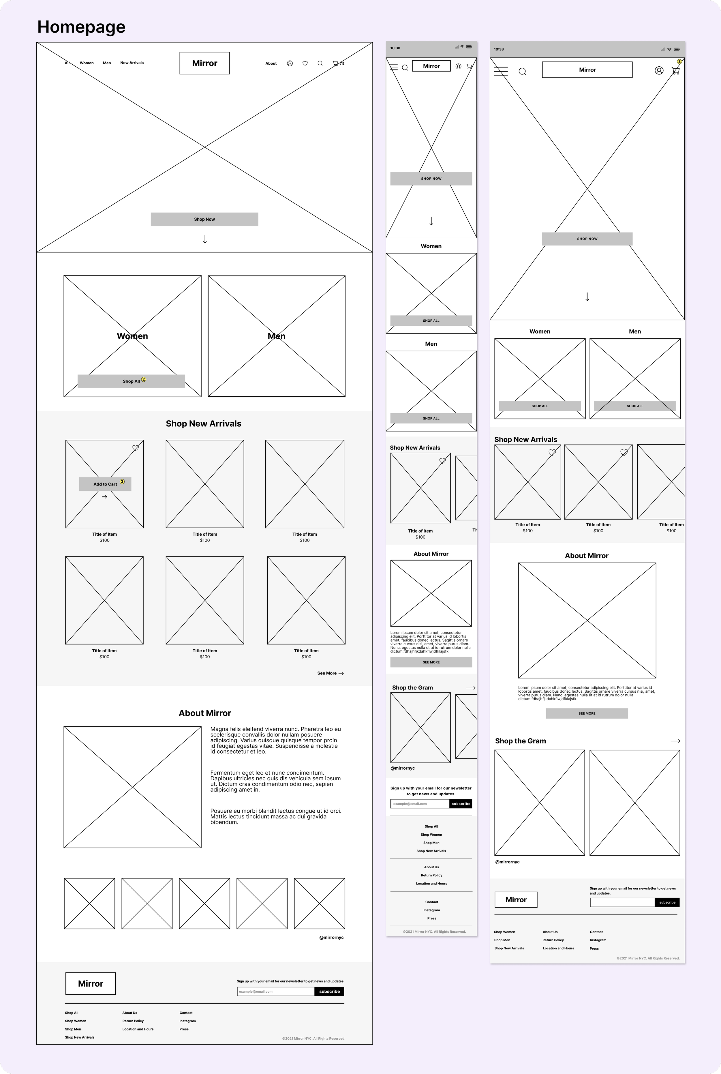
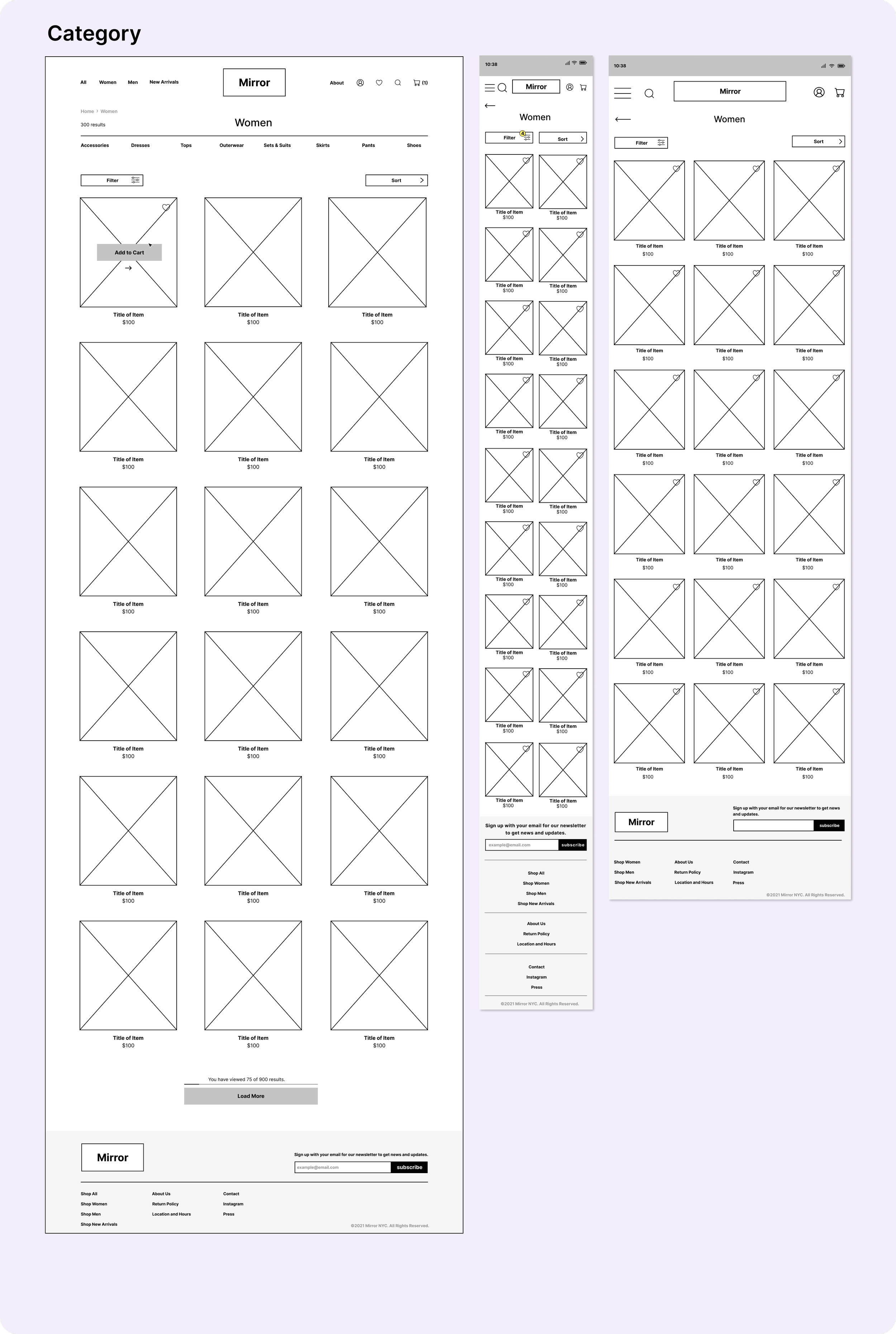
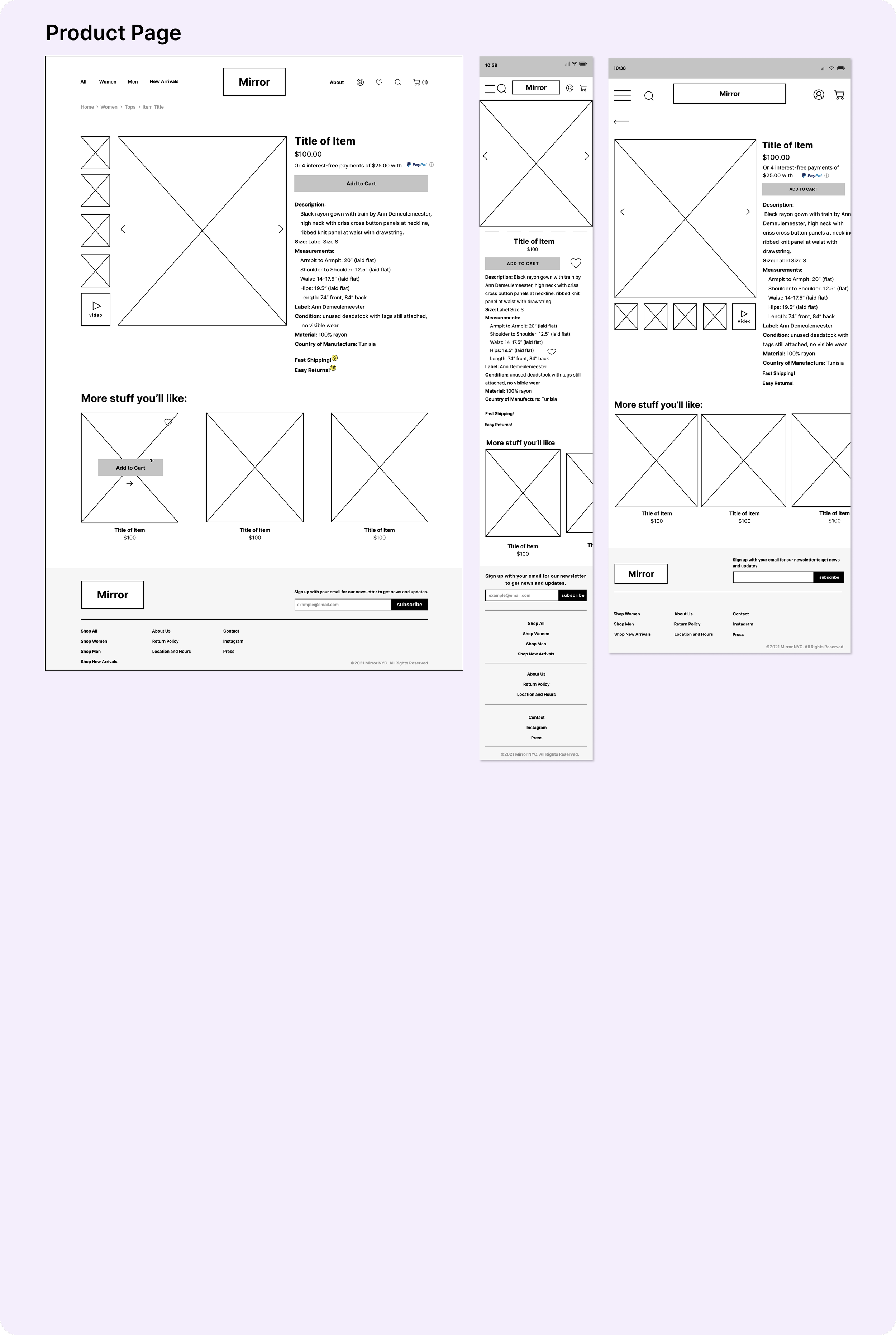
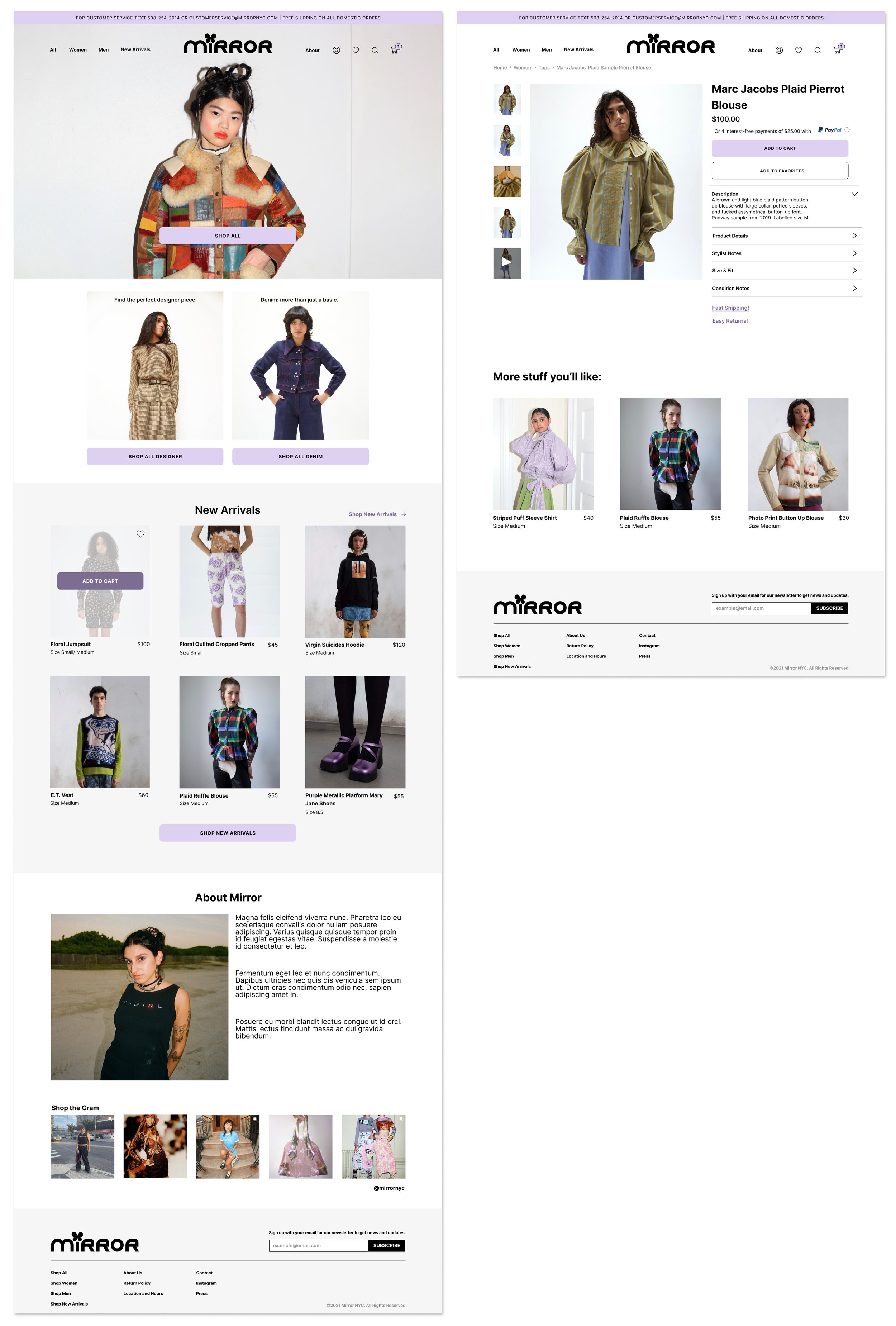
Using my user flows as a guide, I sketched out pages for the tasks and created them on Figma. The homepage will have a hero with a big image, some category pages, listings for new items, an “About” section, a place for instagram pictures, a footer, and a top navigation. I designed drop-down menus for filters and sorting. The product page will have many details listed, detail images and video, plus recommended products.
Making it Responsive
Next, I created designs for tablet and mobile sizes based off of my original set of wireframes. I kept in mind that these frames should be structured similarly to the original frames but optimized for different screen sizes.
Logo Ideation
Creating Mirror’s brand identity
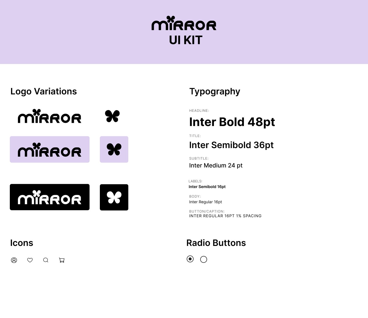
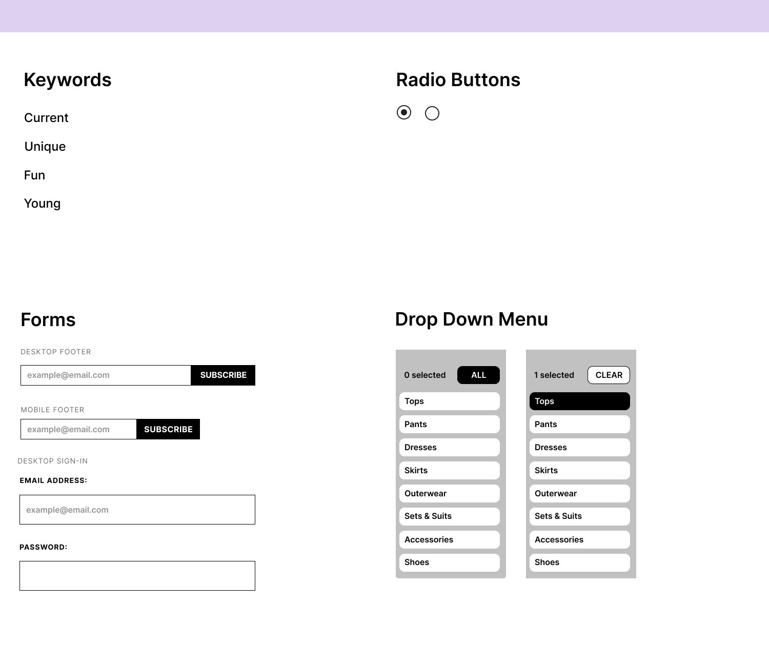
I chose some words that describe Mirror’s identity based on the attitudes of the users in my research: Current, Fun, Unique, and Young. For the first roundup of logo ideas, I drew on a variety of fonts and symbols based on these attributes. I kept in mind the concept of something that felt vintage and contemporary at the same time, since the brand resells clothing while keeping up with current trends. I narrowed it down to four and iterated on those. Finally, I decided on the right-most logo with the graphic butterfly as the dot on the “i”.
UI KIT
Creating brand consistency
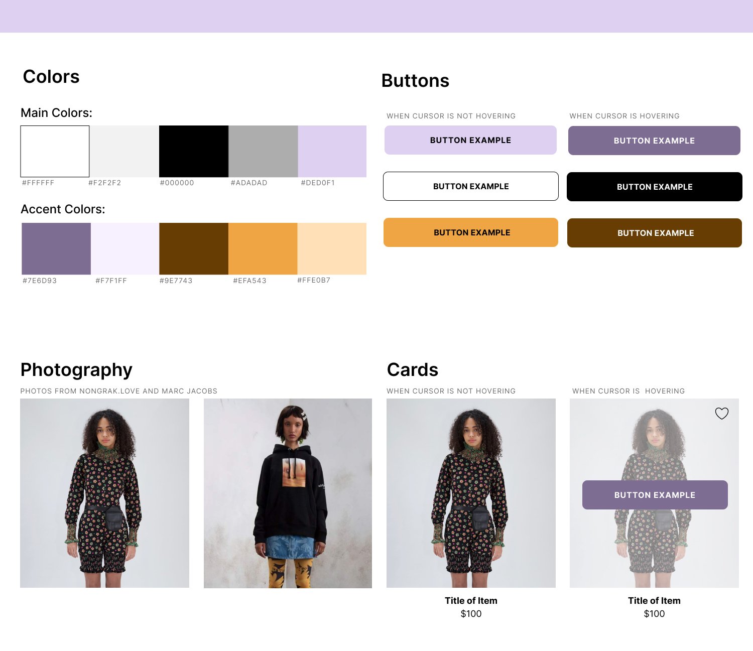
I created a UI kit to ensure that the site's design stays consistent across elements and pages. This document can be revised and added on to as the company expands.
High Fidelity Wireframes
Using familiar design patterns to put it all together
I added the content and visual design to my wireframes so I could conduct usability testing. I chose photography that felt consistent with the brand identity I had created, and referenced design patterns from clothing brands that the users would be familiar with. For example, the checkout process uses forms and radio buttons similar to the Asos checkout. (See All High Fidelity)
Creating a more comprehensive filtering system
When I started to prototype out the us flow, I wanted to give users a more precise filtering system than the “filter” and “sort” buttons. I created a system that had updating dropdown menus that allow people to search for the categories I determined in my cart sort, but also sort items by newest in and price since these aspects were important to users based on my interviews. This feature is especially effective for stores with a lot of product, so it allows Mirror to scale up easily. I planned on testing the efficacy during testing.

Demonstration of finding an item through menus
Test
Usability testing and iterating based on findings

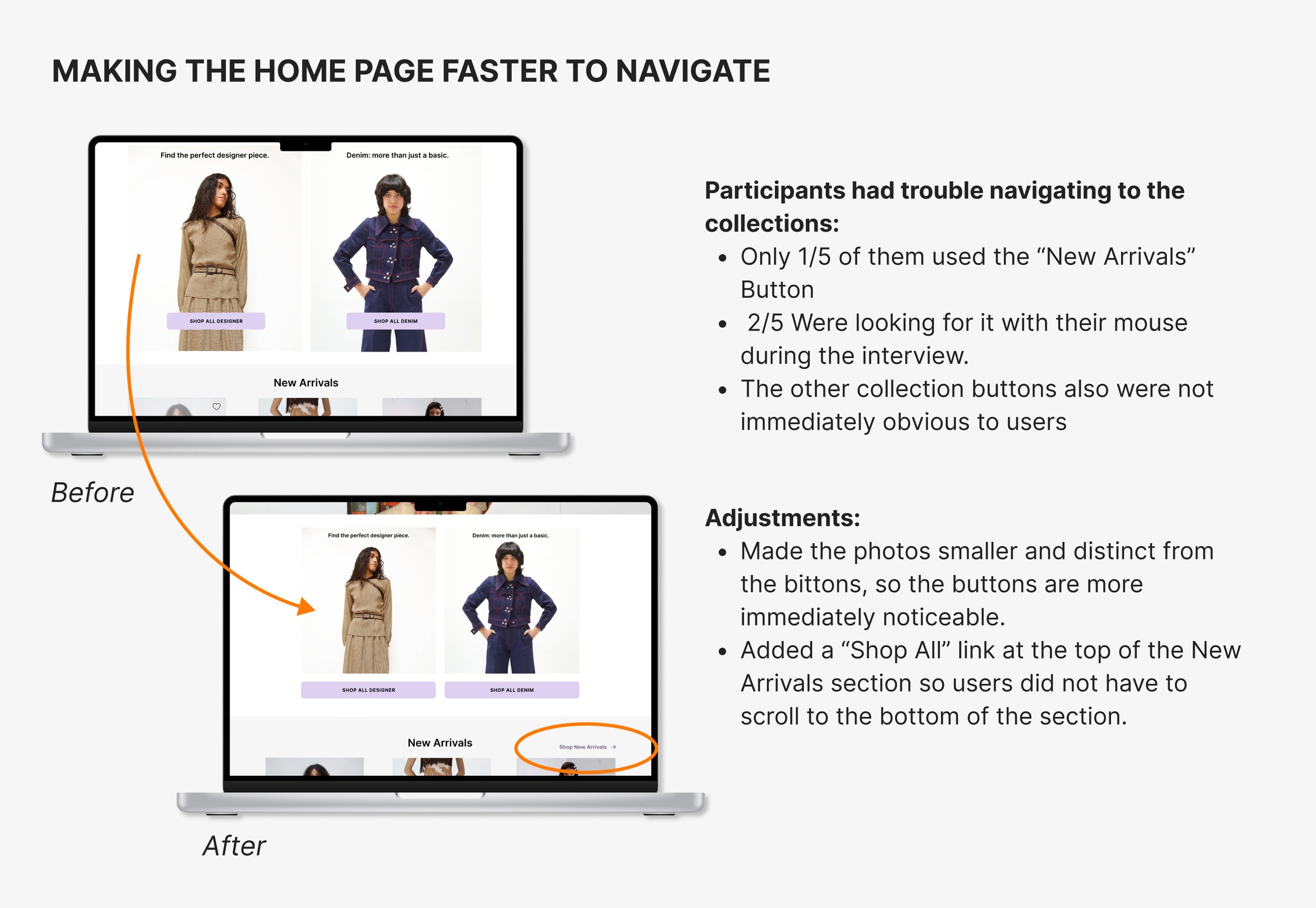
Usability Testing
Testing effectiveness of information architecture and UI
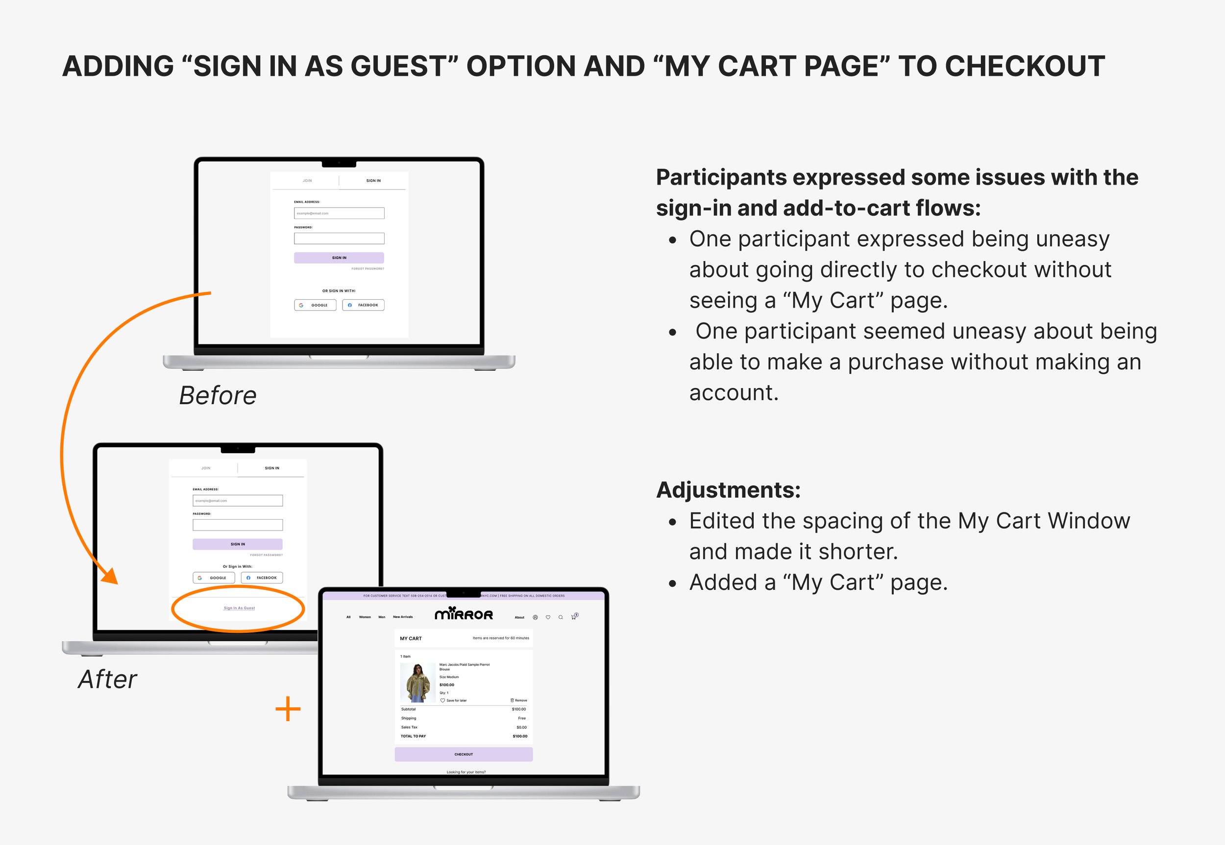
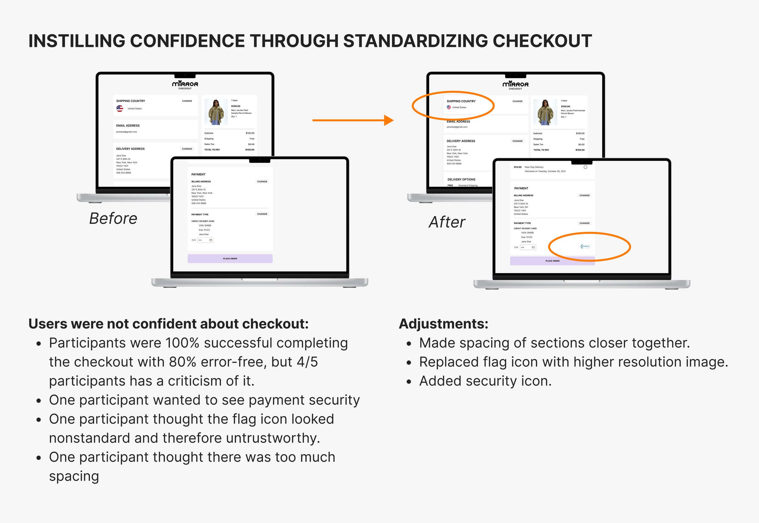
I tested 5 participants to gauge how easily users were able to navigate the UI elements such as the category menus and if the information architecture was consistent with their expectations. I was also testing for any other pain points in the checkout process and gauge participants attitudes towards the overall branding. Participants were asks to find a button down shirt and purchase it.
Finding trends in data through affinity map
I grouped data together based on the topic (overall design, navigation, and checkout and type of data point (action, positive comment, neutral comment, negative comment). This practice helped me determine key insights.

Making necessary improvements
The changes I made were based on the feedback plotted on the affinity map. I noticed that most of these changes were ways of making my designs conform to their expectations of a standard e-commerce site. I believe these changes will make users more confident about making purchases and increase the conversion rate.
The Prototype
Try it out! This prototype is intended to test for the following user tasks:
Test how a user would find a specific item (button down shirt)
Test how a user would add an item to their cart and checkout
KEY TAKEAWAYS
Be observant during interviews: I learned the importance of documentation during interviews. During my user testing, the conversations I recorded offered a lot of important insights, but the most important ones I noticed came from screen recording my users interacting with my site.
Research is ongoing: My initial research was able to serve as the foundation of my plan for designing the Mirror site. I learned how important it was to ask relevant questions and record the interviews. I was constantly doing competitive analysis with similar brands throughout making my design decisions as well, not just in the beginning.
Continue to test and improve the product: One of the biggest challenges in this project was choosing an intuitive and fast way for users to find products they were looking for. There are endless ways to categorize and filter clothing. I suggest continuing to test and do competitive analysis and research to fine tune the filtering system as the inventory for Mirror grows.
NEXT STEPS
I suggest adding certain features like a pop-up modal for newsletter sign up, offering discount codes, and a way for people to purchase gift cards. These features will help achieve Mirror’s goal of gaining more customers. Finally, building out the search function to have a more advanced search would help users find items easily.
